
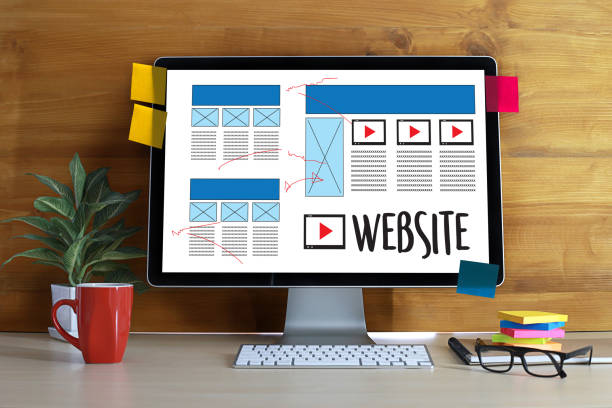
18 Elements of Modern Web Design That You Need to Know in 2023
“Meeting in 5 minutes. All designers be present” – The mail displayed with a blog tagline! “Our web design company in Los Angels is expanding, and eight new clients are getting transferred to us!”
“Great news, boss!”
“We need to give them our best as a creative agency. Each one should recommend us in their known circle. And to be at par or ahead with the latest design trends, we have John Thomas with us from a branding agency who will guide us with the best.
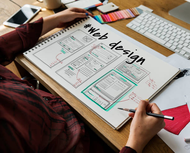
Welcome to our Website design company! The stage is all yours!”
“Hello, fellow designers!
I’m sure you are the best in your space. I’m adding a few tips and going back to some old ones, which we can use in a new and better way!
I’d like you all to note down these 15 web design trends that will likely rule in 2023!”
1. Dark theme
I will start with my favorite one – Dark mode. I’m a fan of dark shades, predominantly black; therefore, I try to implement them for most of my web designs. It highlights things much better.
Some best color combos that work in dark mode:
- Classic Black – White
- Black – Yellow
- Black – Red
- Black – Purple
- Black – Golden
Here, while web designing, you can also have dual mode options – Light mode and dark mode. You must have experienced this in the new ‘Whatsapp update. Try the dark mode option, and you will have a much better user experience to look at the letters in dark mode than in light.
2. Type it big and bold!
Bold is the new beautiful!
Once bold letters were considered a design disaster as it was not too cool to the eyes! However, times have changed, and people love seeing such bold designs.
For instance, you can keep the main word larger than life in size and turn it bold to make it look appealing and out of the box.
3. Have a gin and trust 3D
Who doesn’t like when things go real?
3D dimensions make you feel it all real and not reel.
It is the next gigantic thing in the web design sphere and is going to take over the web in 2023 and is predicted to last at least a decade, as per the experts.
You can make the first glance of the website into 3D dimensions, and as it proceeds, you can make it 2D in case you need more time or budget.
Make it pop out!
4. White space
White space design will never go out of fashion, no matter what!
White space designs are always in as it avoids content congestion and makes it look neat and clean!
Remember, cleanliness is next to godliness; adopting this design trend will make your piece look as godly as possible. Eliminate the unwanted distractions from the view and let them focus on the main!
Leave the extras and rule them out!
5. Red mode
Red flags are bad, but not red mode! It’s in and ruling.
The website will be designed with a red background and white or silver fonts!
It is primarily designed in negative space as white dominates the red!
Please note The red needs blood red or bright red and not the shades of red!
6. Green mode
Who doesn’t love to be among nature?
Green is taking fame and is being adopted by many in the web design sphere. The sole reason why green mode will always work is it is not just soothing to the eyes, but a lot of combo colors work with it, making it look aesthetically rich as well as sober at the same time.
7. Vibe with VIBGYOR
Colors have the power to win hearts!
Vibgyor includes a combination of Violet, Indigo, Blue, Green, Yellow, Orange, Red and I think everyone would accept such combos if matched correctly.
You may feel it’s too much on the palette. However, you need to pick duos of two and do the mismatching to make it look appealing and exciting.
-
Magic of Minimalism
Less is more! – Not just in words but also in websites!
You aim to do less and show more in terms of information.
Here, your visuals and words will play the trick. Again, the wiser you are with them, the better your website gets infused in the heads of your target audience.
9. Keep it moving
Animation and motion are definitely taking the plunge into the audience’s heart!
You portray your product in a way that makes them feel like they are right there experiencing it!
Let’s get them moving together as they enter the website and talk about your services just like in person!
10. A lot can happen over video!
Video is nothing but a direct entry into their minds.
It will help them bank on your product and services without being in an illusionary stage!
Just the video of the best seller’s product or range of services on the home page will do the work for you.
11. Go abstract. Go amazing!
An abstract web design will be nothing but your brand thoughts and visuals mixed into one bundle and portrayed!
It leaves a ground for open interpretation for your audience to connect with your brand the way they want to without being restricted to just your idealogy of your brand representation.
And no doubt it will mark a special place in their hearts and minds!
12.One is enough!
Being single is always better! Did you get me?
Kidding!
Single page website is likable more as it suits perfectly people’s choice! Nowadays, the audience’s attention span is less than a minute while scrolling the website, and having a long will make them leave even sooner!
It’s best to communicate your brand idea in one single stretch instead of taking a long to explain!
Bonus point – Savings you good resources too!
13. Old is gold!
I’m an old-school girl. I’m an old-school girl! – Remember it well?
Yes, retro style is not a design; it’s an emotion.
The minute you showcase oldies well, you are half done grabbing their attention. Half will be done by your products and services – if they are GOOD!
14. Go sassy with split screens.
When you can do two things at the same time, why would you not want it?
It’s that simple a logic!
Communicate two different products on two sides and see the magic in sales! Tell them two tales for the price of one!
15. Greet the glass textures
Glass textures are transparent textures with soft and pastel colors.
The visibility of the fonts is much better in glass texture designs, which excites the viewer’s satisfaction level.
16. If there are forms, make it FULL-SCREEN!
Short forms are gone! It’s time for big and bold!
Design a new page for forms and not just show it on the side like a loner!
17. Win with vectors and avatars
Give your website a character by designing a personal Avatar for it.
Vector images are people’s favorite choice when it comes to images!
18. Be honest with horizontal.
It’s time to go a bit reverse in design – the one thing which was once not liked, it’s time to rethink and enjoy back!
Instead of giving them a vertical scrolling option, provide them with a chance for a horizontal one and see how honestly they love it!
“And here, our design tour ends! I hope we were all on the same page during the session and you could grab it well!
Just take a leap of faith and start experimenting with these trends in your current and upcoming projects!
Long way to go, buddies!”
“Thanks, John. It was amazing and insightful!”